FUNDEC
Website Redesign & Training Platform Optimisation
- role
- Lead UX/UI & Web Designer
- year
- 2022
- focus
- Web Design · UX / UI · Platform Optimisation
deliverables
- UX research & content audit
- Information architecture
- Wireframes & UX flows
- UI design system
- Dynamic training system
- Training calendar & registration
- Accessibility improvements
- WordPress / Elementor build
- CMS training & handover
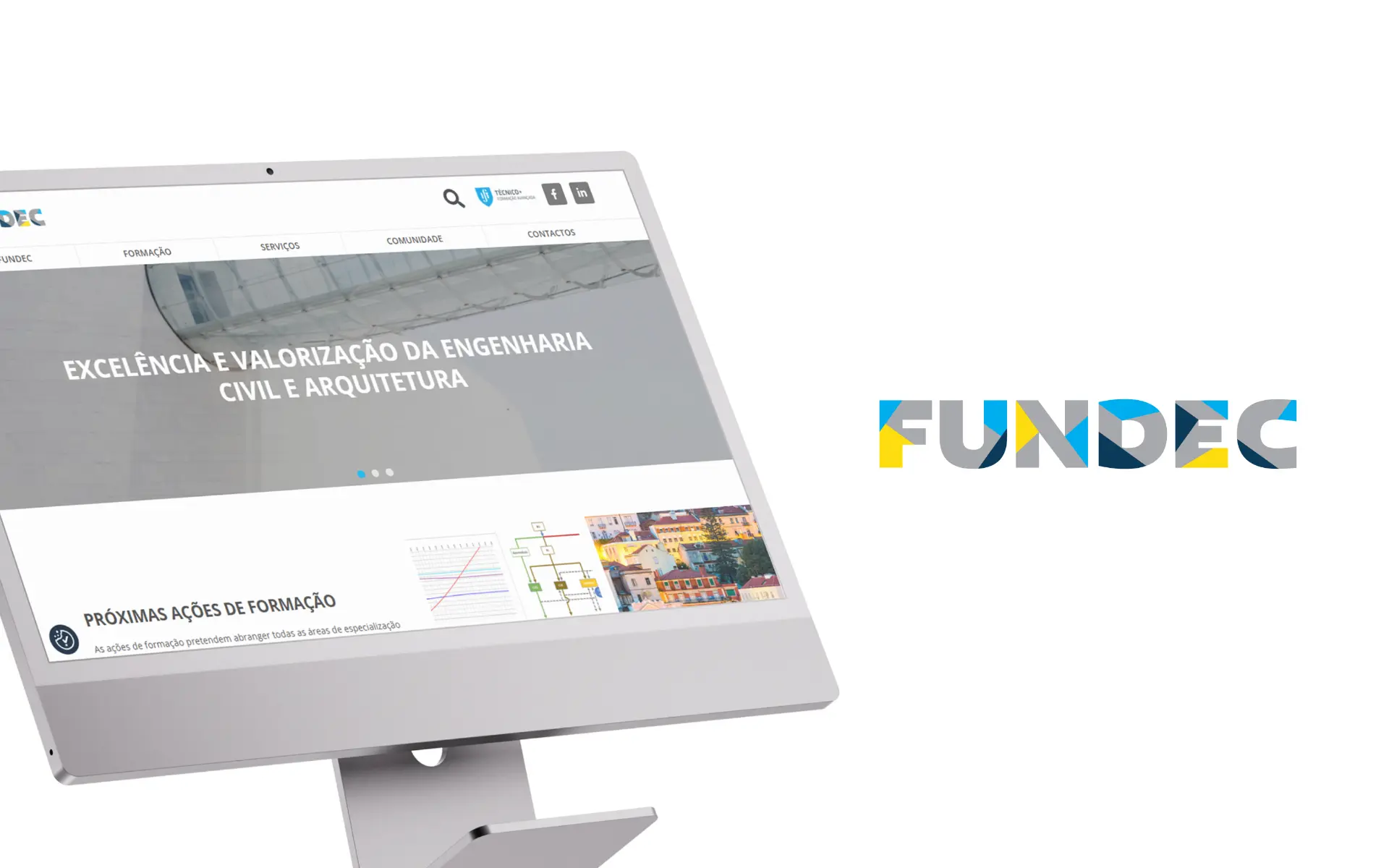
A complete rebuild of a training organisation's website — stabilising the platform, improving accessibility, and empowering internal teams to manage content and programmes with greater independence.
challenge
The old site was working against the institution: a broken theme that couldn't be updated, open security issues, and no simple way to publish the thing FUNDEC exists to offer — training courses. Every new course was a fight with the platform.
approach
Instead of patching a generic theme, the site was rebuilt on a theme designed entirely around FUNDEC's actual needs: courses as structured, detailed entries that the team creates in minutes, with enrolment forms that appear conditionally — open to the public or restricted, depending on each course. Accessibility was treated as a requirement throughout, not a final check.
outcome
The clearest proof the new site works is that the team actually uses it: over 30 news articles published since launch, and over 15 new training courses published — each created, fully detailed and live in around five minutes, with the right enrolment form attached automatically. Security issues resolved, maintenance handled in-house, and a platform that finally keeps pace with the institution's activity.
impact
measurable gains after the rebuild
The rebuild was measured by how much friction it removed — for visitors trying to find and book training, and for the internal team publishing it.
Faster load times, dynamic training pages, smart registration forms and a clearer services narrative turned a slow, manual website into an operational tool.
30+
news articles published since launch
15+
new training courses created and published
≈5 min
average time to create and publish a course
. before & after
a before and an after
before
the previous experience, captured as a reference point
after
the redesigned experience delivered in this project
01 Overview
FUNDEC is a training-focused organisation offering specialised programmes and courses. The existing website, though functional, was built on outdated foundations, creating technical limitations, browser compatibility issues and operational friction for a team that needed to publish and update content regularly.
The project focused on rebuilding the website from the ground up — keeping what already worked for users familiar with the existing experience, while significantly improving accessibility, content management and the training registration journey. The goal was optimisation and stability, not repositioning.
02 The Challenge
The old site was working against the institution: a broken theme that couldn't be updated, open security issues, and no simple way to publish the thing FUNDEC exists to offer — training courses. Every new course was a fight with the platform.
- Broken theme and security issues blocked regular updates
- Publishing a new training course was difficult and time-consuming
- Accessibility had not been considered in the original build
- The platform was undermining the institution's credibility and reach
03 The Approach
A Theme Built Around FUNDEC's Actual Needs
Instead of patching a generic theme, the site was rebuilt on a theme designed entirely around FUNDEC's actual needs: courses as structured, detailed entries that the team creates in minutes, with enrolment forms that appear conditionally — open to the public or restricted, depending on each course. Accessibility was treated as a requirement throughout, not a final check.
Content Reorganisation & Dynamic Logic
A major focus was transforming how training content is managed and displayed. Previously, creating a new training page meant starting from scratch each time — a manual, error-prone process. We reorganised the content into structured, reusable formats and created dynamic systems where new trainings automatically populate listing pages, and individual training pages are generated from structured inputs rather than hand-built each time.
- Reorganised training content into structured, reusable formats
- Created dynamic systems where new trainings automatically populate listings
- Eliminated manual page creation for each training programme
- This shift significantly improved efficiency, consistency and scalability
UX & Wireframing
Wireframes were designed with two audiences in mind: the users navigating training listings and the internal team managing the content behind them. Clear navigation paths were established between listings and detail pages, registration flows were simplified to reduce friction and abandonment during signup, and content-heavy sections received logical structural treatments. The result is a system that proves equally easy to use externally and straightforward to manage internally.
UI Design & Visual Direction
Since this was refinement rather than reinvention, the visual direction focused on enhancing clarity and cohesion without disrupting brand recognition. The layout became cleaner and more structured through improved spacing and clearer visual hierarchy, typography was refined for better readability, and UI patterns were subtly modernised while maintaining consistency across all pages. The goal throughout was to enhance usability without demanding that users relearn the interface.
Training System & Features
Several new functionalities were introduced to improve both user experience and operational management. A training calendar now makes it easier to navigate upcoming sessions at a glance, registration and purchase forms are directly integrated into the experience removing manual intervention, and an automated system closes registrations when capacity is reached or when training sessions are completed. These features streamline both user interaction and the operational management for the FUNDEC team.
04 Accessibility & Usability
Accessibility became a central focus of this redesign, not an afterthought. Every design decision considered contrast ratios and readability, the typographic hierarchy was strengthened to improve scanning and comprehension, navigation patterns were simplified and made more predictable, and the entire platform was built to respond consistently across devices. The result is a platform that is significantly more inclusive and user-friendly, particularly important in an educational context.
- Improved contrast and readability across all content and interactive elements
- Clear typographic hierarchy supporting easier content scanning
- Simplified, consistent navigation patterns
- Fully responsive behaviour across all device types
- Reduced cognitive load through predictable interaction patterns
05 Technology
The platform was rebuilt in WordPress using Elementor — a deliberate choice to remain on a system the internal team already knew and understood. This decision ensured familiarity for the people who would manage it day-to-day, greater autonomy in content updates and training management, and reduced dependency on external systems or developers for routine changes.
Stack: WordPress · Elementor
- Familiarity for internal teams who already knew the WordPress ecosystem
- Greater autonomy and control over content and training management
- Reduced dependency on external systems or developers
06 Brand & Visual System
The identity was intentionally preserved with subtle refinements — respecting the existing visual language while improving clarity, consistency and modernised execution.
- Visual Identity — Existing visual language preserved for continuity, with refinements to spacing and clarity.
- Color Palette — Maintained existing palette with improved contrast for accessibility and hierarchy.
- Typography — Refined typographic hierarchy and improved spacing for clarity and legibility.
07 The Outcome
The clearest proof the new site works is that the team actually uses it: over 30 news articles published since launch, and over 15 new training courses published — each created, fully detailed and live in around five minutes, with the right enrolment form attached automatically. Security issues resolved, maintenance handled in-house, and a platform that finally keeps pace with the institution's activity.
- Over 30 news articles published since launch
- 15+ courses published — each created and live in around five minutes
- Security issues resolved and maintenance handled in-house
- Accessibility implemented as a requirement, not a final check
08 Key Takeaways
- A CMS is only as good as the team's willingness to use it — design the publishing experience for the people maintaining the site, and the content takes care of itself
- Dynamic content systems significantly improve efficiency and scalability for managing complex programmes
- Accessibility should be a priority in educational platforms, not an afterthought
- Maintaining familiar tools and systems can improve adoption and internal autonomy
next project