Karen Tracey
Website Redesign & Brand Repositioning
- role
- Lead UX/UI & Web Designer
- year
- 2024
- focus
- Web Design · UX / UI · Brand Repositioning
deliverables
- Brand repositioning strategy
- Information architecture
- Wireframes & UX flows
- UI design system
- WordPress / Elementor build
- CMS handover & training
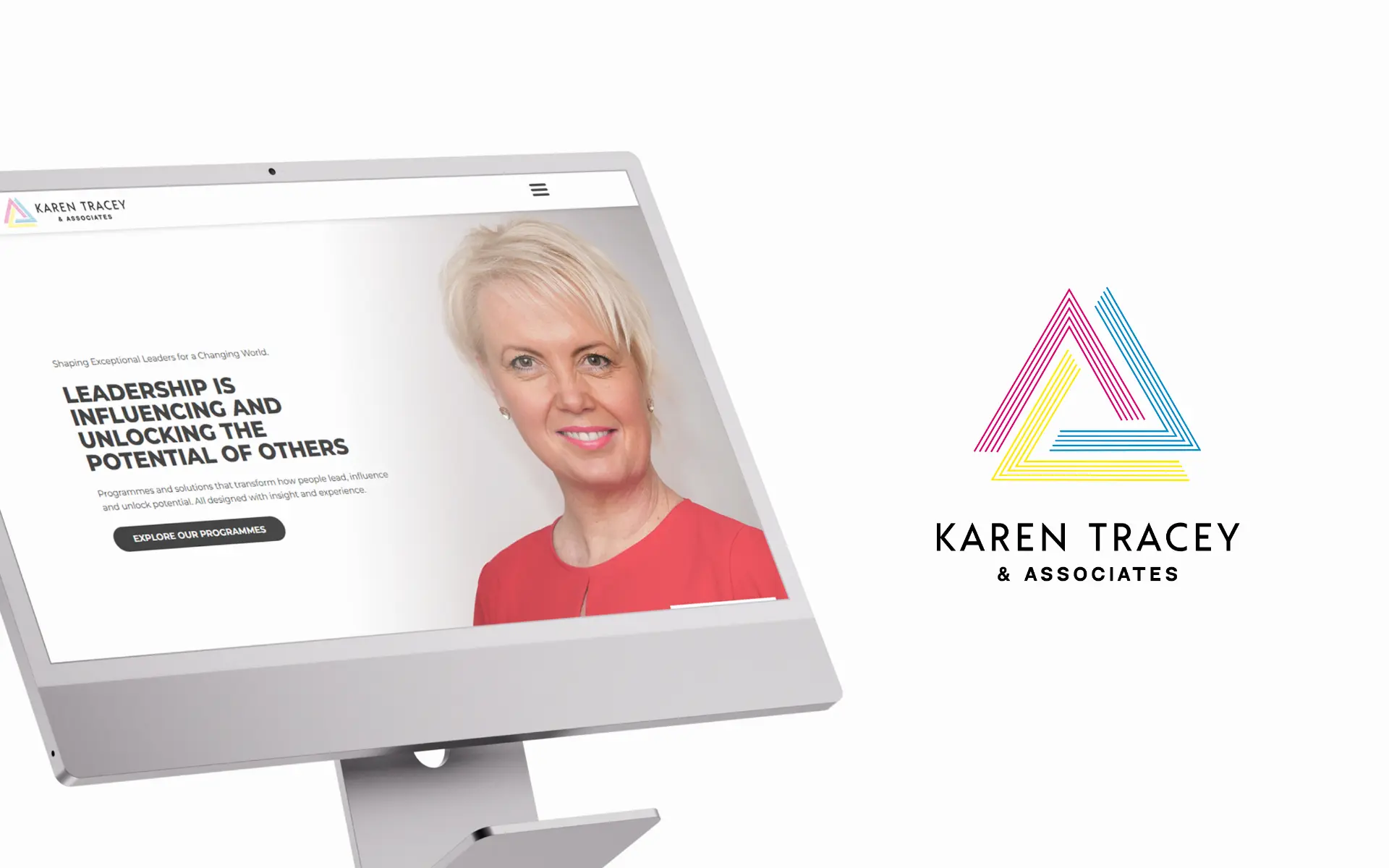
A founder-led website redesign for a UK leadership coaching practice — translating thirty years of expertise into a digital experience that feels personal, premium and unmistakably Karen.
challenge
Thirty years of coaching expertise, invisible online. The previous site read like a template — generic enough to belong to anyone, which for a founder-led practice is the same as belonging to no one.
approach
Repositioned Karen as the central figure, rebuilt the information architecture around how clients actually decide, and softened the visual language with whitespace, typography and quiet confidence.
outcome
A site that sounds like Karen before you ever meet her. New enquiries now arrive through the website.
. before & after
a before and an after
before
the previous experience, captured as a reference point
after
the redesigned experience delivered in this project
01 Overview
Karen Tracey & Associates is a UK-based leadership development and executive coaching practice, led by Karen Tracey and supported by a network of expert associates. Following the transition from Dunelm Leaders to a founder-led brand, the digital presence had to be rethought from the ground up.
The previous website still spoke as a company. The new one had to speak as a person — carrying Karen's voice, her thirty years of experience, and the bespoke nature of how she works with senior leaders. The brief was as much about narrative as it was about design: how do you make a premium, intangible service feel tangible the moment someone lands on the homepage?
02 The Challenge
Thirty years of coaching expertise were effectively invisible online. The previous site read like a template — generic enough to belong to anyone, which for a founder-led practice is the same as belonging to no one. The messaging was dense, the structure no longer matched how senior clients evaluate this kind of work, and the experience offered no real sense of who was on the other side of the conversation.
- A legacy brand identity that had to evolve into something founder-led and human-centered
- Complex, high-value services that needed to be communicated with simplicity and structure
- A senior audience whose expectations of premium were not being met by the existing experience
- A digital presence that needed to feel modern and confident without sliding into trend-chasing
03 The Approach
Brand Repositioning
The starting point wasn't design — it was perception. We worked through how the practice should be read by a first-time visitor: who leads it, what they stand for, and how the surrounding network of associates fits into that story. Karen moved to the centre of the narrative, with associates positioned as a deliberate extension of her work rather than the core of the offer. That single decision shaped tone, hierarchy, photography direction and the entire copy framework that followed.
Content Architecture & Clarity
A significant body of existing content had to be reorganised into something a senior reader could scan in under a minute and still walk away with the right impression. We restructured the site around three clear questions — what is offered, who it's for, and why it matters — and broke dense paragraphs into digestible blocks that could carry weight without demanding effort. Programmes, approach and audiences each got their own distinct space, with clear signposting between them.
UX & Wireframing
Before any visual layer was applied, we mapped the experience as a decision-making journey rather than a marketing site. Wireframes established the rhythm between messaging, services and credibility, with trust signals — testimonials, client logos, experience markers — placed at the moments where a senior reader is most likely to pause and evaluate. The goal was a layout that quietly does the persuasion work in the background.
UI Design & Visual Direction
The visual direction balanced professionalism with warmth. Generous whitespace, a typography-led hierarchy and a lighter colour palette move the experience away from the heaviness of traditional consultancy sites and towards something that feels considered and contemporary. Every UI decision was made in service of the words on the page — so the design carries the brand without ever competing with it.
04 Accessibility & Usability
Accessibility and usability were treated as part of the design language, not a checklist at the end. Type sizes, contrast ratios and spacing were calibrated for readers who are often skimming on a phone between meetings, and interaction patterns were kept consistent across the site so nothing has to be relearned from one page to the next.
- Clear contrast and readable typography across all breakpoints
- Consistent spacing and interaction patterns to reduce cognitive load
- Content structured for scanning, with strong hierarchy and meaningful headings
- Intuitive, predictable navigation across every page
05 Technology
The site was built in WordPress, developed with Elementor — a stack chosen so Karen's team could keep the content alive without depending on a developer for every update. The component approach also made it straightforward to extend the system as the practice grows.
Stack: WordPress · Elementor
- Flexible, day-to-day content management for the internal team
- A scalable structure ready for future programmes and pages
- Efficient implementation of the UI components defined in design
06 Brand & Visual System
The brand and visual system were treated as one cohesive layer — identity, palette and type working together to reinforce the founder-led positioning across every page.
- Visual Identity — Logo system, marks and brand application across the site.
- Color Palette — Quiet, premium tones built around clarity and warmth.
- Typography — Type pairing chosen to lead the reader through long-form thinking.
07 The Outcome
The final website sounds like Karen before you ever meet her. It supports both brand perception at a senior level and business development — making it easier for the right clients to recognise themselves in the offer and start a conversation. New enquiries now arrive through the website.
- A strong, founder-led brand presence centred around Karen
- Improved clarity and navigation, making the services genuinely easier to understand
- A more human, modern and premium digital experience
- A platform aligned with how the business is growing
08 Key Takeaways
- Founder-led brands need personality and clarity in equal measure — one without the other falls flat
- When you're selling something high-value and intangible, structure is doing as much work as visuals
- Good UX directly shapes perception and trust, especially with senior audiences
- Repositioning is as much about what you remove as what you add
next project