4Rs
Website Redesign & Content Simplification
- role
- UX/UI & Web Designer
- year
- 2024
- focus
- Web Design · UX / UI · Content Strategy
deliverables
- Content restructuring
- Information architecture
- Wireframes & UX flows
- UI design in Figma
- WordPress / Elementor build
- Responsive implementation
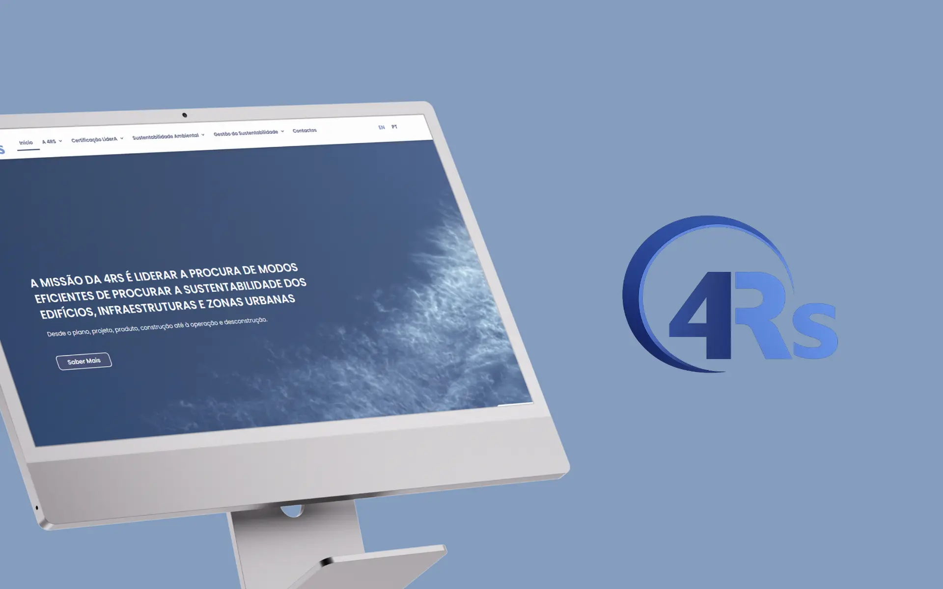
A complete restyle of an institutional, content-heavy sustainability platform — turning a dense academic archive into a clean, accessible and modern reading experience.
challenge
Modernise a content-rich academic platform without losing depth or credibility — making dense material genuinely easier to read, navigate and trust.
approach
Restructured the content into clear hierarchies, rebuilt the UX around calm reading flows, and introduced a minimal, white-led visual system that lets the material breathe.
outcome
A lighter, fully responsive platform where the same depth of content now reads as modern and credible · readable at any screen size and accessible by design, not as an afterthought.
. before & after
a before and an after
before
the previous experience, captured as a reference point
after
the redesigned experience delivered in this project
01 Overview
4Rs is an institutional and academic project focused on environmental sustainability, supported by extensive research and a substantial body of editorial content. The previous platform held all of that knowledge — it just struggled to present it in a way that felt clear, accessible or contemporary.
The project focused on a complete restyle: improving structure, usability and visual clarity from end to end, while protecting the integrity of the original material. The brief wasn't to rewrite the content; it was to give it a setting worthy of being read.
02 The Challenge
The site had accumulated the typical limitations of long-running academic platforms — a visual language that no longer matched current standards, page after page of dense text, weak responsive behaviour and a CMS structure that made even small updates difficult. The result was an experience that asked too much of its readers, regardless of how valuable the underlying material was.
- An outdated visual design out of step with current expectations
- Content-heavy pages built around long, dense text blocks
- Poor responsive behaviour across devices
- Limited flexibility to update and manage content
- No clear or intuitive user journey through the material
03 The Approach
Content Reorganisation
Given the volume and density of the material, structure had to come before aesthetics. We broke long text blocks into scannable sections, introduced a consistent hierarchy across headings, paragraphs and sub-sections, and reshaped the flow so readers could navigate the content the way they actually use it — moving between depth and overview without losing their place. The goal was to keep the richness of the material intact while making it easier to read, navigate and understand.
UX & Wireframing
Wireframes were used to define a calmer, more intuitive structure across a platform with a lot of moving parts. We simplified navigation, designed a logical reading flow tuned for academic content, and aligned consistency across pages so visitors always knew where they were and where they could go next. The journey, by the end, feels clear, calm and purposeful.
UI Design & Visual Direction
The visual approach is deliberately minimal. White becomes the primary surface, letting the content lead, supported by a soft and neutral palette that protects readability over long sessions. Typography and structure carry the weight of the design, while visual noise is kept to a minimum so the material can do its job. The result reads as light, modern and academically credible.
04 Accessibility & Usability
For an academic, public-facing platform, accessibility wasn't optional — it was the point. The system was tuned for readability over long sessions and across very different devices, with structure doing as much accessibility work as the styling layer.
- High contrast between text and background, across the full system
- Clear typographic hierarchy supporting fast scanning
- Structured layouts that hold up at any screen size
- Fully responsive design across devices
- Simplified navigation to reduce cognitive load
05 Technology
The site was designed in Figma and built in WordPress with Elementor — a setup that gives the team full autonomy over content and a structure that can grow with the project's research output.
Stack: WordPress · Elementor · Figma
- Easy, day-to-day content management and updates
- A scalable structure ready for new research and sections
- Efficient implementation of the design components
06 Brand & Visual System
The visual system respects the academic nature of the project and modernises its presence — a clean, neutral aesthetic built around clarity, credibility and the absence of distraction.
- Visual Identity — Clean, neutral aesthetic focused on clarity and credibility.
- Color Palette — White-led palette with subtle neutrals and restrained accents.
- Typography — Highly readable type with hierarchy tuned for long-form reading.
07 The Outcome
The new platform turns a dense, dated experience into something modern and accessible. The same depth of content is still there — but it now reads as a contemporary, structured resource rather than an archive to fight through — readable at any screen size and accessible by design, not as an afterthought.
- Significantly improved readability and navigation
- Fully responsive and adaptable across devices
- Simplified content structure without losing depth
- Accessibility and readability tuned for long-form academic reading
- A more modern and credible digital presence
08 Key Takeaways
- Content-heavy platforms need structure before aesthetics — the order matters
- White space is doing real work when the information is dense
- Accessibility is non-negotiable for academic and public-facing projects
- Simplification improves both usability and how the work is perceived
next project