WPO Portugal
Membership Landing Page Design
- role
- UX/UI & Web Designer
- year
- 2023
- focus
- Landing Page · UX / UI · Conversion Design
deliverables
- Landing page strategy
- Wireframes & UX flow
- UI design in Figma
- Conversion-led content structure
- WordPress / Elementor build
- Responsive implementation
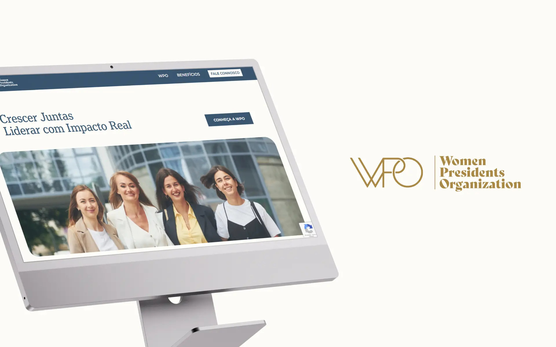
A dedicated membership landing page for WPO Portugal — translating a high-value, international proposition into a clear, persuasive and conversion-oriented digital experience.
challenge
Communicate a premium, exclusive membership in a way that is both accessible and persuasive, while staying perfectly aligned with the global WPO brand.
approach
Designed a focused, conversion-led landing page built around a clear narrative, structured content blocks and a measured visual language consistent with the WPO global identity.
outcome
A focused acquisition tool that frames the membership proposition with clarity, builds trust progressively and supports WPO Portugal's growth strategy.
01 Overview
WPO Portugal is part of a global network dedicated to supporting women entrepreneurs and business leaders in scaling their companies sustainably, strengthening competitiveness and fostering long-term economic impact.
The project focused on designing a dedicated landing page to drive membership acquisition in Portugal — translating a high-value, international proposition into a clear, compelling and conversion-oriented digital experience aligned with the global WPO brand.
02 The Challenge
The core challenge was to communicate a premium and exclusive offering in a way that was both accessible and persuasive. The page had to speak to senior-level female leaders and decision-makers — an audience that gives a landing page only seconds before deciding whether the proposition is credible — while staying perfectly aligned with the global WPO brand and its tone of voice.
- Translating a complex, high-value proposition into a clear membership offer
- Structuring content for senior-level female leaders and decision-makers
- Building a strong sense of trust, exclusivity and credibility
- Designing a focused journey optimised for conversion and lead generation
03 The Approach
Conversion-Focused Strategy
The landing page was designed around a single, explicit objective: convert qualified visitors into members. Every section was placed to progressively build value and trust, with a clear narrative running from awareness to decision and consistent calls-to-action threaded throughout. The experience was crafted to answer three questions, in order: what is WPO, why does it matter, and why should I join now.
Content Structuring & Clarity
Given the depth of the offering, the content had to be simplified without losing impact. We organised the proposition into clear, digestible sections that surface the strongest pillars of the membership — PeerView monthly sessions, educational programmes, high-impact events and global networking, and access to premium resources such as Harvard Business School programmes — making it easy to scan the value at a glance and dig deeper where the reader is genuinely interested.
UX & Wireframing
Wireframes shaped a strong, logical journey: a confident entry point with a clear value proposition, progressive disclosure of benefits and features, and the strategic placement of testimonials, credibility signals and CTAs at the moments where decisions are actually made. Friction was treated as the enemy at every step.
UI Design & Visual Direction
The visual design follows the WPO brandbook while optimising for digital performance. Light backgrounds let the content breathe; blue tones are used strategically to highlight key sections and CTAs; whitespace and hierarchy are calibrated to feel professional without ever feeling sparse. A subtle visual rhythm between sections keeps engagement steady, with extra emphasis on key metrics and benefits — and the layout was tuned for both desktop and mobile conversion.
04 Accessibility & Usability
Even within a tightly conversion-focused page, accessibility and usability were treated as part of the design language — not a layer added at the end. The result is a seamless and frictionless user journey, regardless of device or context.
- Clear typographic hierarchy for easy reading
- Strong contrast for improved accessibility
- Structured layouts supporting fast scanning
- Intuitive navigation and CTA placement
- Fully responsive behaviour across devices
05 Technology
The page was designed in Figma and built in WordPress with Elementor — a setup that gives the team flexibility to iterate on copy, sections and campaigns over time without depending on a developer for every change.
Stack: WordPress · Elementor · Figma
- Flexibility for future updates and iterations
- Easy management of content and campaigns
- Efficient implementation aligned with the design
06 Brand & Visual System
The landing page strictly follows the WPO global identity, reinforcing professionalism, exclusivity and alignment with the international network — while adapting the system to perform on a focused, conversion-led page.
- Visual Identity — Aligned with the WPO global identity — professional, credible, exclusive.
- Color Palette — Light, neutral base with strategic blue accents for emphasis and CTAs.
- Typography — Clean, structured type system with hierarchy tuned for readability.
07 The Outcome
The landing page successfully translates a complex, premium offering into a clear and engaging experience. It now acts as a focused acquisition tool, framing the membership proposition with clarity and building the trust required for senior leaders to take the next step.
- Stronger clarity of the membership value proposition
- Improved user journey and engagement
- Increased conversion readiness through structured content and CTAs
- A digital experience aligned with both global brand standards and local audience needs
08 Key Takeaways
- High-value offers need clarity and structure to convert — premium alone doesn't sell itself
- Design has to balance brand consistency with performance goals, not pick one over the other
- Visual hierarchy is doing direct work on decision-making, not just aesthetics
- A well-designed landing page is both a narrative and a conversion tool — the two reinforce each other
next project