LiderA
Full Website Redesign & Platform Modernisation
- role
- Web Designer
- year
- 2022
- focus
- Web Design · UX / UI · Platform Design
deliverables
- Full structural redesign
- Content reorganisation
- Wireframes & UX flow
- UI design in Figma
- WordPress / Elementor build
- Private user area integration
- Responsive implementation
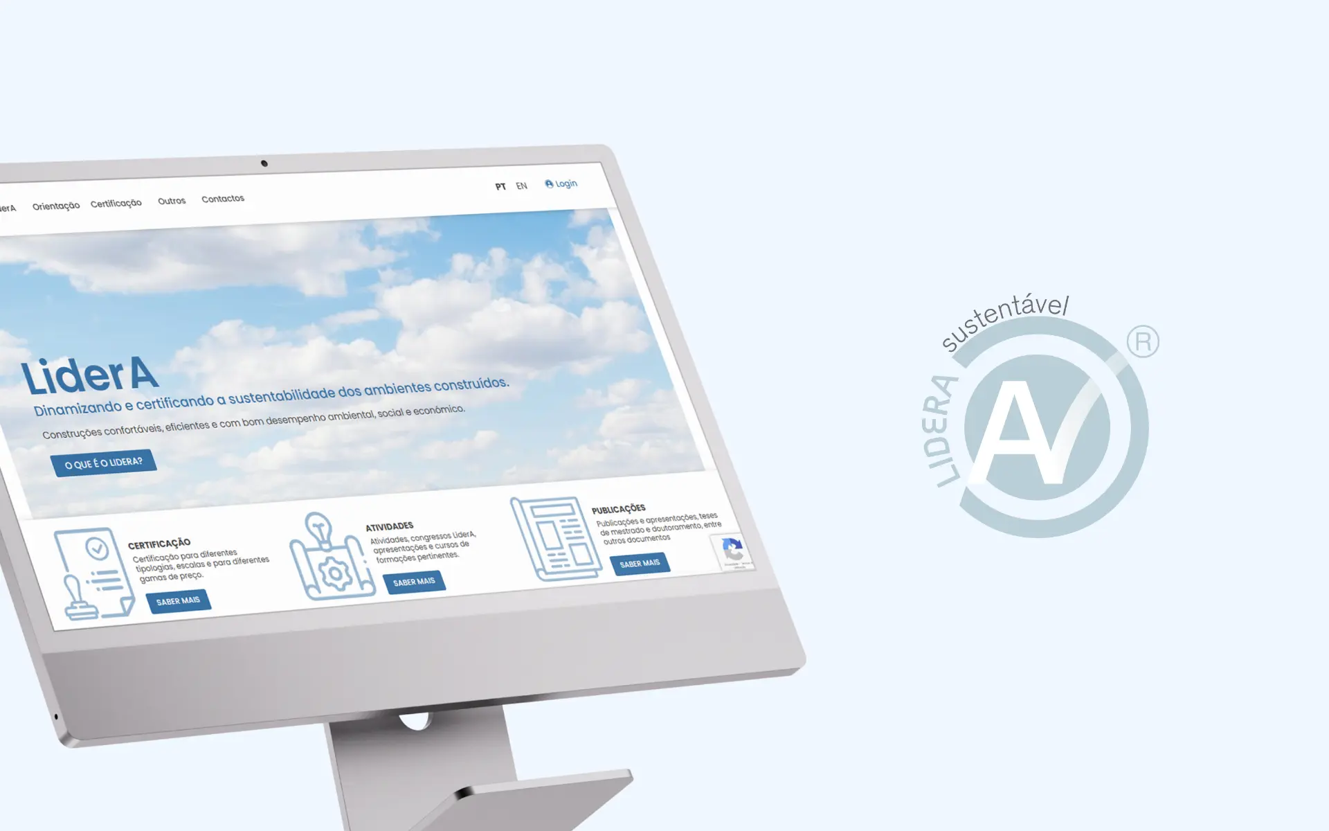
A complete website and platform redesign for a sustainability assessment and certification system — transforming an outdated digital presence into a modern, accessible experience for public users and registered members.
challenge
The legacy site couldn't be updated, didn't adapt to modern devices, and scattered essential information across pages nobody could maintain. But the real problem was operational: LiderA's certification process — assessors submitting projects, the team evaluating and certifying them — had no digital home at all. The site didn't just need a redesign; it needed to become a working tool.
approach
Two tracks, one system. The public site was rebuilt around clearly defined areas so the certification framework finally reads as organised as it is. In parallel, a private submission area was designed from the assessor's point of view: submit a project, track its evaluation, receive certification — a workflow that previously lived in email threads.
outcome
LiderA moved from a static, unmaintainable site to a platform that runs its core process. Assessors submit projects directly through the private area and the team evaluates and certifies inside the same system. Public pages now carry genuinely useful information instead of dispersed fragments — and the whole site is managed in-house, with no developer needed for day-to-day updates.
. before & after
a before and an after
before
the previous experience, captured as a reference point
after
the redesigned experience delivered in this project
01 Overview
LiderA is a sustainability assessment and certification system focused on promoting environmental responsibility across the full lifecycle of construction projects — from initial concept through to operation and rehabilitation.
This project involved a complete redesign of the website and platform, transforming an outdated and limited digital presence into a modern, accessible and scalable experience, both for public users exploring the system and for registered members managing certification processes.
02 The Challenge
The legacy site couldn't be updated, didn't adapt to modern devices, and scattered essential information across pages nobody could maintain. But the real problem was operational: LiderA's certification process — assessors submitting projects, the team evaluating and certifying them — had no digital home at all. The site didn't just need a redesign; it needed to become a working tool.
- Legacy site was unmaintainable and unresponsive across modern devices
- Certification workflow existed outside the platform, mostly in email threads
- Essential information was scattered and hard to find
- The site needed to become a working tool, not just a redesigned brochure
03 The Approach
Public Site as a Clear Certification Framework
The public site was rebuilt around clearly defined areas so the certification framework finally reads as organised as it is. Content was structured to support both learning and action, with clear signposting between system explanation, educational material and user actions such as registration and login.
Private Submission Area from the Assessor's Point of View
A private submission area was designed from the assessor's point of view: submit a project, track its evaluation, receive certification — a workflow that previously lived in email threads. The same system lets the internal team evaluate and certify projects, replacing manual handoffs with a single, self-service workflow.
04 Accessibility & Usability
Accessibility and usability were core to the redesign from the earliest stages. High readability was maintained across long-form content, navigation structures were designed to be clear and logical, and consistent UI patterns reduced cognitive load despite the complex subject matter. The experience is designed to be inclusive, intuitive and efficient.
- High readability across long-form content
- Clear navigation and logical page structures
- Consistent UI patterns throughout
- Fully responsive behaviour across devices
- Reduced cognitive load despite complex subject matter
05 Technology
The platform was built in WordPress with Elementor, with UI design work done in Figma. This stack allows for flexible content management, scalable growth of the platform, and integration of both public content areas and private certification workflows.
Stack: WordPress · Elementor · Figma
- Flexible content management for evolving material
- Scalable structure supporting platform growth
- Integration of both public and private areas
06 Brand & Visual System
The visual identity respects the academic and environmental positioning of LiderA — clean, neutral and focused on credibility, with subtle alignment to sustainability themes.
- Visual Identity — Clean and neutral aesthetic with focus on clarity and credibility.
- Color Palette — White dominant with blue highlights and soft, restrained tones.
- Typography — Clean, highly legible system with strong hierarchy for complex information.
07 The Outcome
LiderA moved from a static, unmaintainable site to a platform that runs its core process. Assessors submit projects directly through the private area and the team evaluates and certifies inside the same system. Public pages now carry genuinely useful information instead of dispersed fragments — and the whole site is managed in-house, with no developer needed for day-to-day updates.
- Certification workflow now runs inside the platform, not in email threads
- Assessors can submit projects and track evaluation status
- Public pages carry genuinely useful, well-organised information
- Whole site managed in-house without developer dependency for day-to-day updates
08 Key Takeaways
- Sometimes the brief says 'redesign' but the problem says 'product' — the biggest UX win wasn't visual, it was turning a manual certification process into a self-service workflow
- Complex systems require clear structure and simplified communication
- Platforms must balance public information with private functionality
- Accessibility is essential in knowledge-driven environments
next project