Mind7Academy
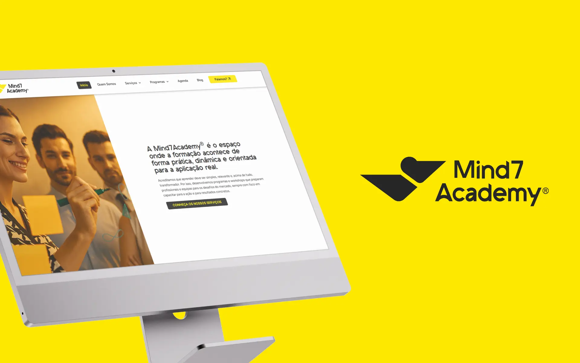
Website Redesign & Visual Identity Alignment
- role
- UX/UI & Web Designer
- year
- 2024
- focus
- Web Design · UX / UI · Brand Alignment
deliverables
- Information architecture
- Wireframes & user flows
- UI design system
- Events & dynamic agenda module
- Modular landing pages
- WordPress / Elementor build
Translating the merger of two Portuguese growth-focused businesses into a single, scalable digital home — clearer to navigate, lighter to read, and built to grow with the brand.
challenge
Two growth-focused businesses became one — but online, they were still two brands, two messages and two audiences pulling apart.
approach
Aligned the site with the new visual identity, restructured the architecture around clear user paths, and introduced modular layouts ready to support events, programmes and future expansion.
outcome
One coherent digital home: the team now launches new events and editions without design support, and the site is built to scale as the merged brand grows.
01 Overview
Mind7Academy was created from the union of Pelicano Consultores and Mind7Academy® — two organisations with a shared mission of supporting people and businesses through their growth journeys, but historically operating with separate identities, audiences and channels.
The project focused on translating that merger into a single, cohesive digital experience: one that could carry the breadth of the new offer, reflect the refreshed visual identity, and scale gracefully as new programmes and events were added over time.
02 The Challenge
Two growth-focused businesses became one — but online, they were still two brands, two messages and two audiences pulling apart. Navigation was fragmented, the UI was visually dated, and the existing content didn't communicate the fact that the business now operated as a single integrated ecosystem. A substantial volume of pages, programmes and editorial material had to be carried across and reorganised — without losing what was working.
- A fragmented legacy structure inherited from two separate brands
- An outdated UI with difficult, inconsistent navigation
- A broader, integrated offer that the old site couldn't articulate
- A new visual identity that needed a digital home aligned to it
03 The Approach
Alignment with the New Brand Identity
We worked closely with the brand designer leading the new identity to make sure the website wasn't just compatible with the brand — it actively reinforced it. Every layout decision, from spacing to component design, was checked against the new positioning so the digital experience would land as a natural extension of the brand, not a separate dialect of it.
Content Restructuring & Simplification
The information architecture was rebuilt around the integrated nature of the new business. Instead of forcing visitors to understand the merger, we let the structure do that work for them: clear entry points by user need, consolidated messaging across overlapping areas, and a hierarchy that quickly answers 'what does Mind7Academy offer me, right now?'
- Training
- Mentoring & coaching
- Consulting
- Entrepreneur support
UX & Wireframing
Wireframes were used to stress-test the structure before any visual was applied — particularly around how users move between services, events and ongoing programmes. The system had to support both casual exploration and decisive conversion, and it had to do that without becoming complex for the team that maintains it.
UI Design & Experience
The visual direction is lighter, more dynamic and noticeably more youthful than the previous site, while keeping enough structure to guide users through a layered offer. A modular system of components made it possible to introduce dedicated landing pages for events and mentorship programmes, alongside a dynamic agenda surfacing what's coming next.
04 Accessibility & Usability
Given the variety of audiences — from students to entrepreneurs to corporate clients — the experience was deliberately designed for ease of use across very different user profiles, with clear hierarchy and consistent UI patterns throughout.
- Clear visual hierarchy and readable typography
- Simplified navigation paths, regardless of entry point
- Consistent UI patterns reused across the system
- Designed for ease of use across a wide range of audiences
05 Technology
Built in WordPress and developed with Elementor, the site gives the internal team the autonomy to publish, schedule and update without external support — a critical requirement for an organisation that constantly opens new editions, events and programmes.
Stack: WordPress · Elementor
- Easy, day-to-day content updates by the internal team
- A scalable system for events, agenda and recurring programmes
06 Brand & Visual System
The new brand identity is the connective tissue across the experience. The website was the first place where it had to live at full scale, so the visual system was carefully translated into digital components.
- Visual Identity — Refreshed brand mark and applications across the site.
- Color Palette — Energetic, modern tones aligned with the new positioning.
- Typography — Type system supporting both editorial content and UI clarity.
07 The Outcome
The new platform is one coherent digital home. Visitors land in a unified, modern experience and can move between services, events and programmes without ever feeling the seams of the legacy brands underneath. The team now launches new events and editions without design support, and the site is built to scale as the merged brand grows.
- A unified, clear digital ecosystem aligned with the new identity
- Improved usability and navigation, replacing a fragmented experience
- A modern, engaging interface aligned with the target audience
- The team can launch new events and editions without design support
- A scalable structure ready for future events, programmes and growth
08 Key Takeaways
- Merging brands requires more than combining services — it demands clarity in structure and narrative
- Strong information architecture is essential when a single site has to serve multiple offers and audiences
- A modern visual layer can shift perception, but only if it sits on solid UX decisions
- Scalability is much cheaper to build in from day one than to retrofit later
next project