Pedaços de Cacau
Christmas Campaign — Landing Page & Email
- role
- Web & Campaign Designer
- year
- 2023
- focus
- Landing Page · Email Marketing · Campaign Design
deliverables
- Campaign concept & narrative
- Landing page UX & UI
- Email marketing design
- Visual system for the campaign
- WordPress / Elementor build
- Brevo email implementation
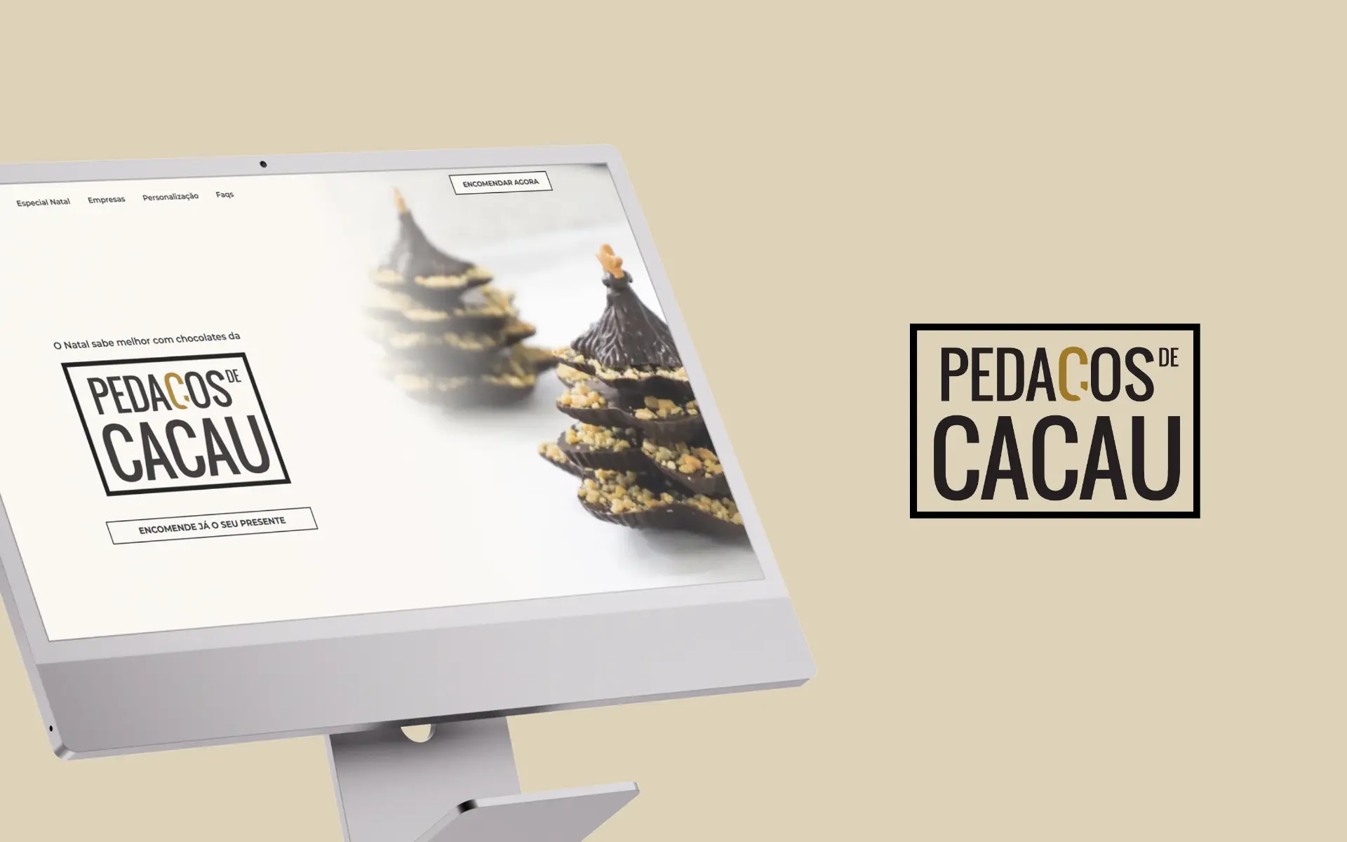
A Christmas campaign for an artisanal chocolate brand — landing page and email marketing working together to elevate perception and drive seasonal sales.
challenge
Move the brand's perception further into premium territory during the most competitive moment of the year, while keeping the journey from inbox to checkout effortless.
approach
Designed a cohesive campaign ecosystem — landing page and email — built around gifting, with an Instagram-inspired visual language and a measured layer of micro-interactions to reinforce craft.
outcome
A campaign that lifted seasonal sales over the previous year and visibly raised the brand's premium perception.
01 Overview
Pedaços de Cacau is an artisanal chocolate brand looking to consolidate its position as a premium chocolatier. Christmas is the most decisive moment of their commercial year — and also the noisiest, with every player in the category competing for the same attention and the same gifting budget.
The project focused on a single, focused campaign: a dedicated landing page and a coordinated email marketing flow, designed to work as one continuous experience rather than two channels speaking past each other.
02 The Challenge
The brief had two pressures pulling in opposite directions. On one side, the brand needed to feel unmistakably premium — slower, more crafted, more considered than the seasonal noise around it. On the other, the campaign had to actually convert, in a window where users decide quickly and abandon faster. The connection between email and landing page had to feel inevitable, not bolted together at the last minute.
- Elevate perception clearly into premium positioning
- Stand out inside a saturated, fast-moving seasonal context
- Connect email marketing tightly to the landing-page conversion flow
- Design a journey that feels seamless from first touch to checkout
03 The Approach
Campaign Ecosystem
Landing page and email were designed together from day one, sharing the same visual direction, tone of voice and pacing. The result is a single journey that simply changes surface: the email opens the door, the landing page invites the visitor in, and every step reinforces that this is a brand that pays attention to detail.
UX & Wireframing
The structure was built explicitly around a gifting flow rather than a generic product flow. We highlighted hero products with confidence, reduced the number of decisions a buyer had to make, and removed the small frictions that tend to compound in the final stretch of a Christmas purchase — when patience is short and competing tabs are many.
UI Design
The visual layer is rich but disciplined. Inspired by the brand's Instagram presence, it leans into close-up product photography, warm tones and quiet typography, with subtle micro-interactions used as signals of craftsmanship rather than decoration. Every element earns its place; nothing is asked to do too much.
Email Marketing
The email side of the campaign carries the same visual system as the landing page, with consistent tone and structure. Clear, confident CTAs lead directly into the relevant moments of the journey, so the transition from inbox to landing page never asks the reader to recalibrate.
04 Accessibility & Usability
Even with a richer, more sensorial visual treatment, readability and navigation remained non-negotiable. The campaign was tuned for speed and clarity on mobile — where most of the traffic actually happens during the holidays.
- Readable layouts with clear, generous hierarchy
- Smooth navigation and predictable interaction
- Visual richness balanced with clarity at every step
- Optimised for conversion with minimum friction
05 Technology
The landing page was built in WordPress with Elementor, and the email campaigns were designed for delivery through platforms like Brevo. The combined stack made it straightforward to launch, iterate and measure within the tight Christmas window.
Stack: WordPress · Elementor · Brevo
- Fast build and iteration during the seasonal window
- Reusable assets across channels
- Clear measurement loop between email and landing page
06 Brand & Visual System
The campaign borrowed from the brand's existing visual world and translated it into something more focused — a seasonal extension rather than a separate identity.
- Visual Identity — Brand expression adapted for the seasonal campaign.
- Color Palette — Premium, warm tones with a festive accent layer.
- Typography — Editorial-leaning type pairing reinforcing craft.
07 The Outcome
The campaign delivered both on commercial and brand fronts. Sales grew compared to the previous year, the brand felt visibly more premium across every touchpoint, and the journey from email to checkout finally felt like a single, coherent piece of work.
- Increase in sales versus the previous year
- Stronger premium perception across the campaign
- Cohesive presence across email and landing page
- An improved, more confident conversion journey
08 Key Takeaways
- Strong campaigns earn results when brand and performance are designed together
- Consistency across channels compounds — every shared cue makes the next click easier
- Premium isn't a colour choice; it's the accumulation of detail and coherence
- Designing an email and a landing page in isolation is almost always a missed opportunity
next project